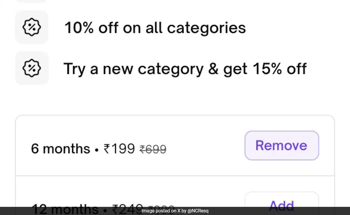
The controversy centers around Urban Company's checkout process.
A Bengaluru designer, Chandra Ramanujan's recent post on X is going viral on the internet. In his post, he accused Urban Company's app of using "dark patterns" - design tricks that can mislead users.
His 60-year-old father unintentionally subscribed to the company's premium plan due to the app's interface. This incident has sparked a debate about the app's design choices, and even the app's designer has weighed in!
Mr Ramanujan in a post on X wrote, "My dad (late 60s, not tech savvy) got confused by one of the worst dark patterns I've ever seen inside the Urban Company app, and ended up paying for UC plus even though he didn't mean to. They automatically add a 6 month membership to your cart and make it confusing to remove."
The controversy centers around Urban Company's checkout process. Here's how it works: Once you book a service, it goes into your cart. The cart also promotes their "Plus" subscription and automatically adds a 6-month plan to your total!
The option to remove the subscription is phrased in a way that might be confusing. It uses a red button that says "No, I will pay full price." This red colour, typically associated with warnings, might make users think it's a bad option, leading them to skip it altogether.
Essentially, the design choices could trick users into accidentally subscribing. Especially for people in a hurry, the fine print might be easily overlooked.
In a subsequent post, Mr Ramanujan attached a screen recording showing the process. He criticised it as "basket sneaking," emphasising that it is illegal. "I couldn't believe it so I tried to replicate it. I downloaded the app, and the same splash screen came for me. At the 25 second mark, see how the basket value changes automatically when you click on the add to cart CTA. This is basket sneaking and it is illegal," he wrote.
See the post here:
My dad (late 60s, not tech savvy) got confused by one of the worst dark patterns I've ever seen inside the Urban Company app, and ended up paying for UC plus even though he didn't mean to. They automatically add a 6 month membership to your cart and make it confusing to remove pic.twitter.com/1kN8Bx73W0
— Chandra Ramanujan (@NCResq) March 25, 2024
Soon after his post went viral, others in the comments section criticised Urban Company for deceiving customers with their poor design. A user pointed out, "Reported this a year ago, nothing happened. As a designer, one of the first responsibilities you have is to be honest in design. They should avoid using such trickery."
Another user commented, "The option of not paying for plus is in red so it feels like the wrong option to pick. Not sure if it was meant to be a dark pattern but there could have been a clearer distinction here for sure."
"For real! @urbancompany_UC thinks it's a smart move and maybe they earn a few bucks with this tactic but it's really about cheating. Cheating since not all the consumers are tech savvy, some are also in a hurry and don't really give a glance.," the third user commented.
The viral post also caught the attention of Urban Company's Director of Design, Amit Jaglan who said he will fix it. "As a principle, we always strive to do right by our users and our partners. We will fix this by next week, Tuesday." He assured that post-fix, no plan would be auto-selected, the CTA wouldn't be in red, and would instead read, "Maybe later."


Leave a Reply